Project: Private Label Packaging
Client: Fareway
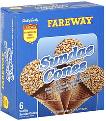
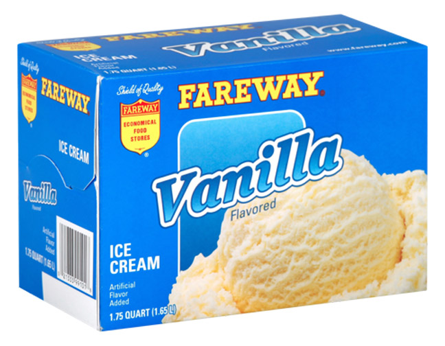
Challenge: Develop a new package architecture for Fareway private label ice cream and frozen novelties that influences quality perceptions and stays in harmony with other Fareway packaging.
Solution: This new architecture was a significant improvement in Fareway’s ice cream and frozen novelties packaging. The solid background allows the logo, name and products to pop off the carton, while providing a color cue for shoppers. The smaller widow with a graduated blend gives product images an anchor point and allows them break out of that space for the appearance of bigger size and flavor. The product/flavor name, with angled type and outer key line, is easy to read and expand across all line extensions.